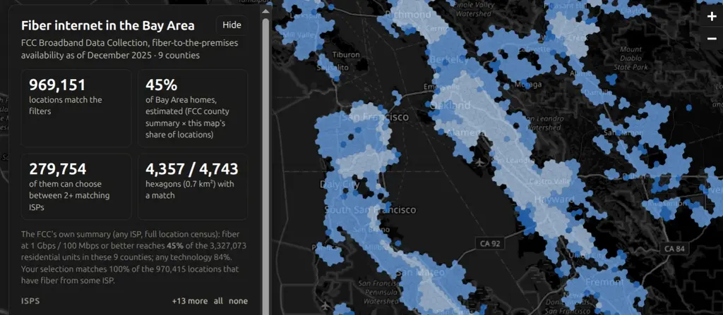
An interactive map of where fiber-to-the-premises internet is available across the nine Bay Area counties, built from the FCC’s Broadband Data Collection (the data behind the National Broadband Map). It includes every ISP that files fiber availability with the FCC (AT&T, Sonic, Comcast/Xfinity, Astound, and more), and can be filtered by ISP, minimum advertised download speed, and residential vs business locations.
The map has three levels of detail depending on zoom: H3 hexagons for the whole region, 2020 census blocks, and individual building footprints from DataSF and Overture Maps. Areas can be colored by fastest available speed or by how many ISPs serve them, which makes it easy to see where there is actual competition. Clicking an area shows every ISP present, their advertised speeds, whether they reach all or only some of the locations, and a link to the same spot on the FCC’s map.
Census blocks are the finest public geography available, since the FCC’s per-address location data is licensed and not part of the public download. The whole thing is a static page (Leaflet, no build step) generated by a set of Python scripts and deployed to GitHub Pages.